Trending Home Décor Colors Checklist for Room Makeovers
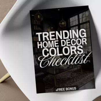
Trending Home Décor Colors Checklist for Stylish Room Makeovers (Print, Plan, Refresh)
Color is the fastest way to update a room—when it’s chosen with intention. Our team built this guide around a simple checklist method that helps you move from “I like it” to “I know where it goes.” You’ll map color roles first, use fast pairing rules to avoid mismatches, and follow room-by-room prompts that keep your palette cohesive—whether you’re refreshing a rental, planning a full makeover, or swapping in seasonal accents. For more guidance, see INTERIOR DESIGN QUICK START GUIDE CHEAT SHEET.
What the Checklist Approach Solves (and Why It Works)
When you’re staring at hundreds of paint chips and “perfect” inspiration photos, the real challenge is decision fatigue. A checklist solves that by narrowing your options to a curated set of current, livable tones—and by giving each color a job before you shop. For further reading, see Interior Design Quick Start Guide Cheat Sheet.
- Reduces overwhelm by focusing you on a handful of trend-forward (but usable) color families.
- Keeps the makeover cohesive by assigning roles (base/main/accent/finishes) before you buy anything.
- Prevents the most common mismatch: a swatch you love that feels “off” in your lighting and layout.
- Makes updates easier: you can swap accents seasonally while keeping foundations steady.
- Creates a clear plan: what to paint, what to replace, and what to keep.
Start Here: Choose Color Roles Before Choosing Colors
If you choose colors first, you often end up with too many “mains” competing for attention. Instead, give your room a simple hierarchy. Once roles are clear, picking actual shades gets dramatically easier.
| Role | What It Usually Covers | Best Commitment Level | Quick Swap Ideas |
|---|---|---|---|
| Base | Walls, large rug, sofa | Long-term | Throw blanket, slipcover, runner |
| Main | Bedding, drapes, accent chair | Medium | Curtain panels, duvet cover |
| Accent | Pillows, art, vases | Short-term | Pillow covers, prints, candles |
| Natural Warmth | Wood/leather/woven textures | Long-term | Trays, baskets, stools |
| Finish | Hardware, lighting, frames | Long-term | Picture frames, cabinet pulls |
Two rules that keep everything polished: (1) your base should be calm and flexible, and (2) pick one dominant metal finish with one supporting finish so the room doesn’t feel “random.”
Trending Color Families That Style Well in Real Homes
Trends come and go, but certain families consistently look elevated because they pair well with common fixed elements (wood floors, stone counters, neutral upholstery). Here are the color directions we’re seeing show up across major forecasts and real-world homes.
- Softened earth tones: clay, terracotta, sand, warm taupe—cozy, forgiving, and great with texture.
- Nature-inspired greens: olive, sage, deep forest—calming as a base or rich as a statement.
- Moody blues: ink, navy, smoky denim—instant depth, especially with warm woods.
- Modern warm neutrals: greige, mushroom, oatmeal, caramel—clean and current without feeling stark.
- Muted pastels with depth: dusty rose, misty lilac, pale apricot—best as accents or in bright rooms.
Fast Pairing Guide for Color Families
| Color Family | Best Pairings | Avoid This Common Clash | Best Rooms |
|---|---|---|---|
| Soft earth tones | Cream + walnut + brushed brass | Too many reds together | Living room, entry, dining |
| Greens | Warm white + oak + matte black | Icy grays that turn it dull | Kitchen, bedroom, office |
| Moody blues | Camel leather + ivory + bronze | Cold chrome everywhere | Bedroom, media room, study |
| Warm neutrals | Black accents + linen + light wood | Overusing beige with no contrast | Whole-home base, halls |
| Muted pastels | Warm white + natural fiber + light oak | Pairing with harsh bright white | Nursery, bath, guest room |
If you want to cross-check what’s trending, you can compare forecasts from Pantone Color Institute, Sherwin-Williams Colormix Forecast, and Benjamin Moore Color Trends.
Room-by-Room Checklist Prompts (So the Color Lands in the Right Place)
Where you place the trend color matters as much as what color you choose. Use these prompts to “assign” the boldest choices to the most forgiving spots.
How to Use the Digital Download for a Clean, Confident Makeover Plan
Featured: Our planning tools to keep you on track
- Trending Home Décor Colors Checklist digital download — our printable + screen-friendly system for building a room palette you can actually shop.
- Wireless Bluetooth Backlit Number Pad for Apple Devices — helpful if you’re budgeting your makeover, tracking measurements, or building a room-by-room cart from your tablet.
- Mini Pocket DAB/DAB+ FM Radio MP3 Player with Speaker & Rechargeable Battery — a simple way to make your paint-and-refresh weekends feel less like chores.
Small Changes That Make Trend Colors Look Intentional (Not Accidental)
FAQ
How many trending colors should be used in one room?
Use one trend color as your main or accent, supported by one to two neutrals. The 60/30/10 approach helps: base (60%), main (30%), accent (10%), then repeat the accent color a few times so it feels cohesive.
Does the checklist work for rentals where paint isn’t an option?
Yes—use your base color through large textiles and neutrals, then bring the trend color in through swappable items like bedding, curtains, removable wallpaper, art, and décor. You’ll get the look without committing to permanent changes.
How can color choices stay consistent across an open floor plan?
Choose one shared base color across connected spaces, repeat a single accent color in each zone, and vary intensity (light/medium/dark) to keep it interesting. Keeping wood tones and metal finishes consistent also helps the whole area read as one design.








Leave a comment